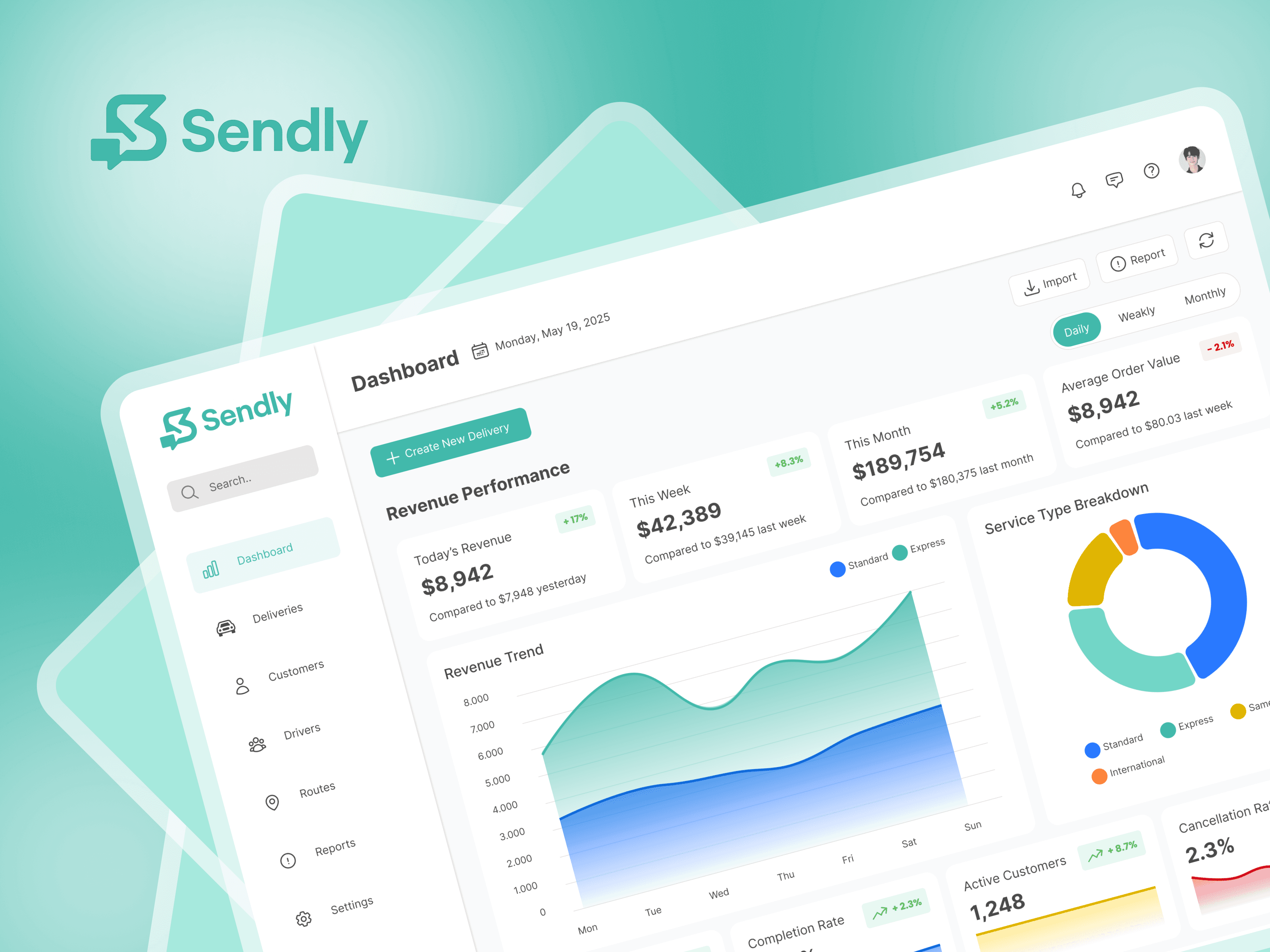
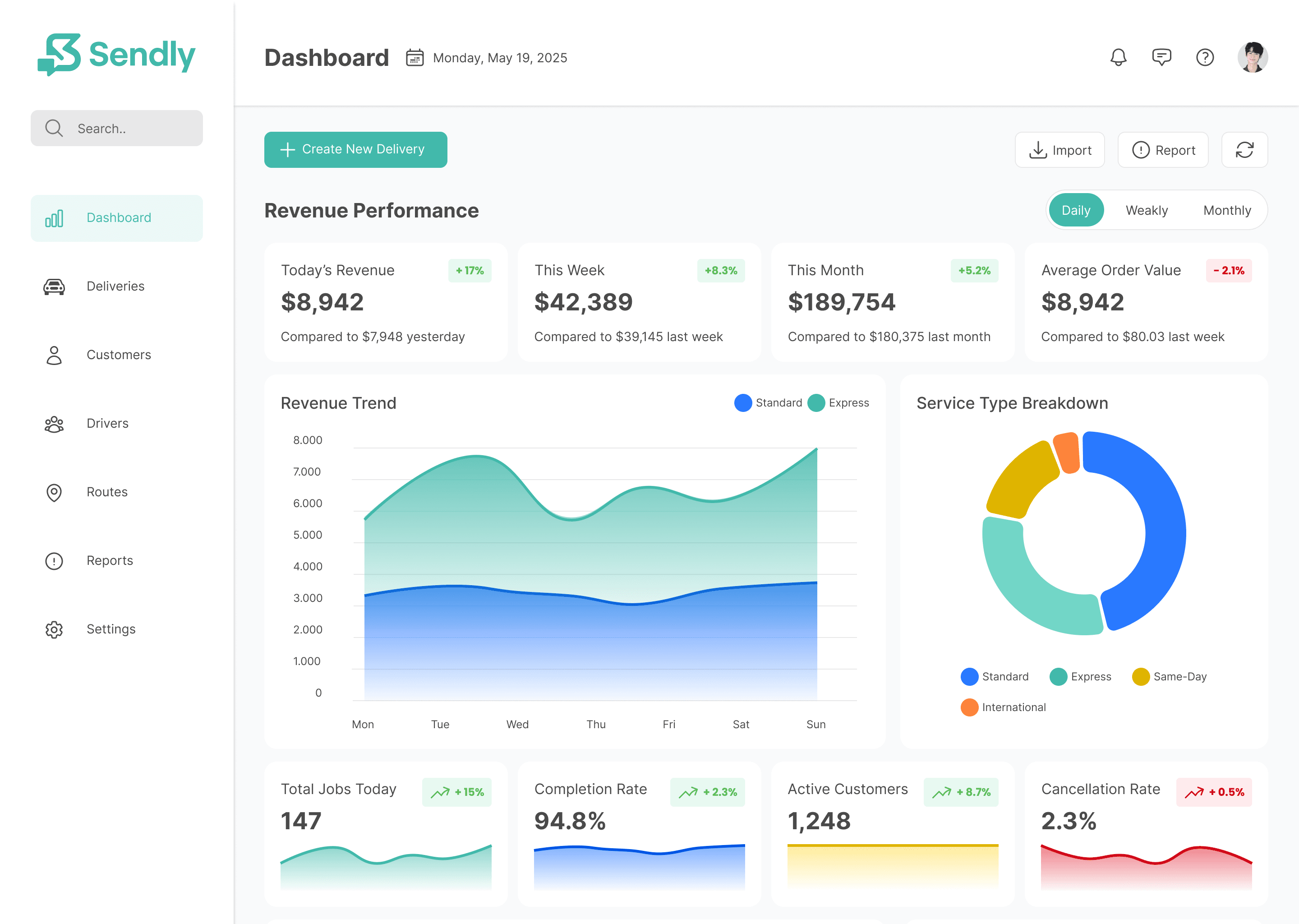
Sendly is a logistics management platform that simplifies the process of tracking deliveries, monitoring revenue, and managing customer and driver data. The goal of this UI design challenge was to craft a modern, scalable, and data-focused dashboard that delivers clarity and efficiency to logistics teams.
Design Objective
To create a responsive web dashboard that allows operations managers to view real-time logistics data, revenue performance, and service analytics with minimal friction. The dashboard must support decision-making and daily operational workflows with high usability.
Key UX/UI Solutions
Clean Layout with Prioritized Data
The interface prioritizes critical metrics such as revenue, completion rate, active customers, and order value using a modular card system. Each data block uses visual indicators like trends, percentages, and comparison metrics to improve insight at a glance.Filterable Performance Views
Users can toggle between Daily, Weekly, and Monthly reports to view revenue trends over time—supporting both quick check-ins and deep-dive analyses.Service Type Breakdown with Visual Charts
A donut chart visually segments delivery types (Standard, Express, International), aiding operational planning and helping identify performance by service category.User-Friendly Navigation
A vertical sidebar ensures fast access to critical features like Deliveries, Customers, Drivers, Routes, Reports, and Settings. The visual consistency and icon usage enhance usability and orientation.Modern, Scalable UI Design
The use of clean typography, soft color gradients, and white space creates a professional and trustworthy brand impression, while also keeping the data easy to digest.